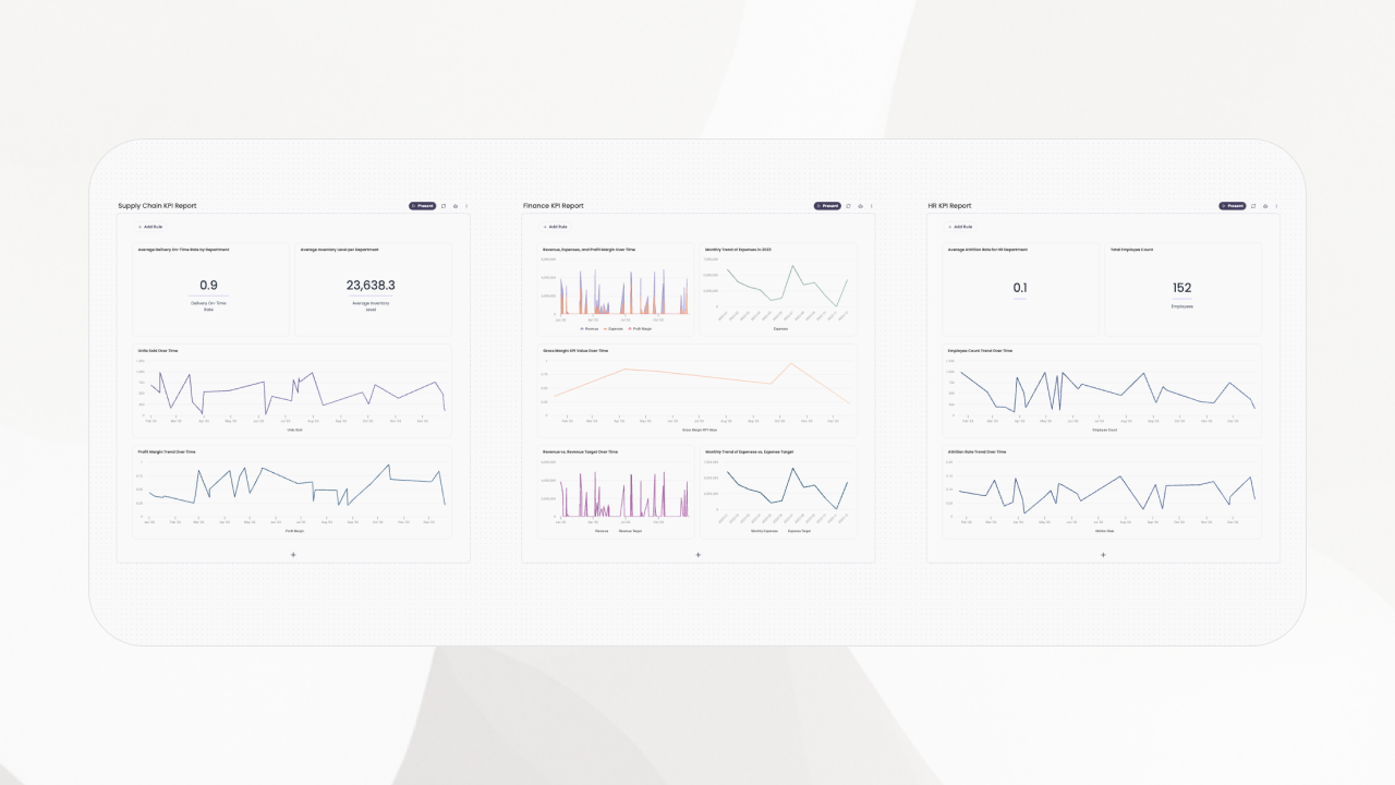
I share how I use KPI reporting to guide decisions, with uses, pros and cons, AI impact, dashboards versus reports, a creation framework, and templates.
I share how I use KPI reporting to guide decisions, with uses, pros and cons, AI impact, dashboards versus reports, a creation framework, and templates.
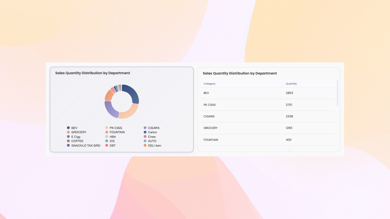
How I use pivot tables for exploration and pivot charts for communication—when to choose each and how they work together.
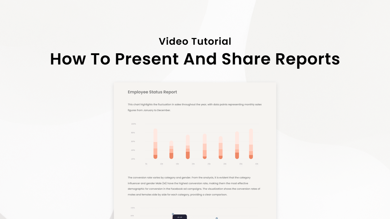
Learn how to transform your data insights into compelling, interactive stories with Breadcrumb's presentation and sharing features. Master the art of report storytelling with our comprehensive tutorial.

Discover how AI-powered data tools can replace Excel for faster, more scalable business insights without formulas or manual data cleaning.
Watch our complete feature walkthrough showing how Breadcrumb transforms data analysis from static reports to dynamic, AI-powered insights. See auto-generated dashboards, seamless data combining, and interactive exploration in action.
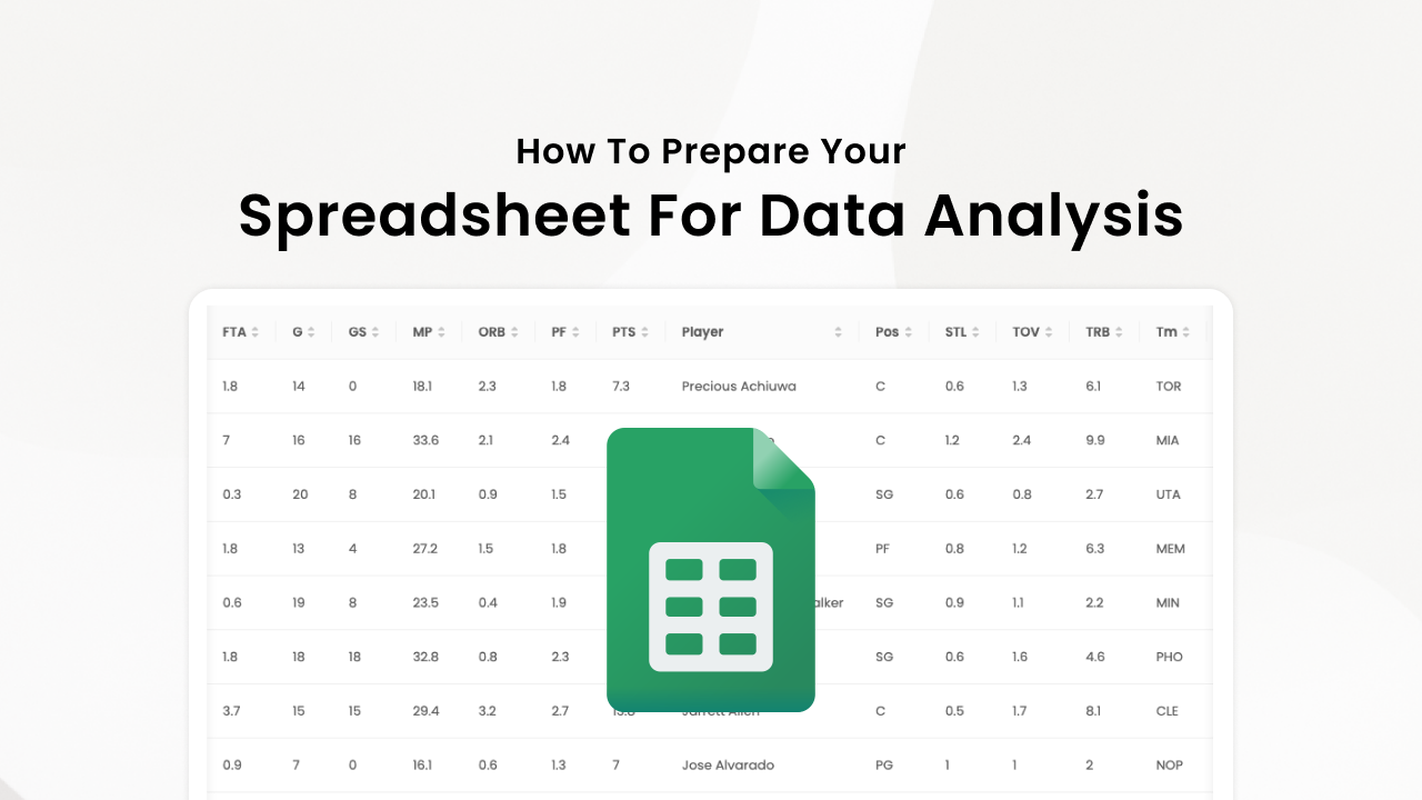
Learn what raw data table format means, why it's crucial for spreadsheet uploads, and how AI-powered tools like Breadcrumb automatically clean your data for better analytics.

Master the art of prompting for AI data analysis. Learn practical techniques to get better insights faster from tools like Breadcrumb, with real examples and conversation strategies.

Unlock deeper insights from your events by connecting Eventbrite or Ticket Tailor to Breadcrumb. Learn how to combine attendee data with marketing, CRM, and sales sources to understand your audience, optimize ROI, and generate actionable reports — all without a data team.

Discover how AI-powered analytics can help you unlock hidden patterns in your Google Analytics data. Get instant insights, automate reporting, and make data-driven decisions faster.
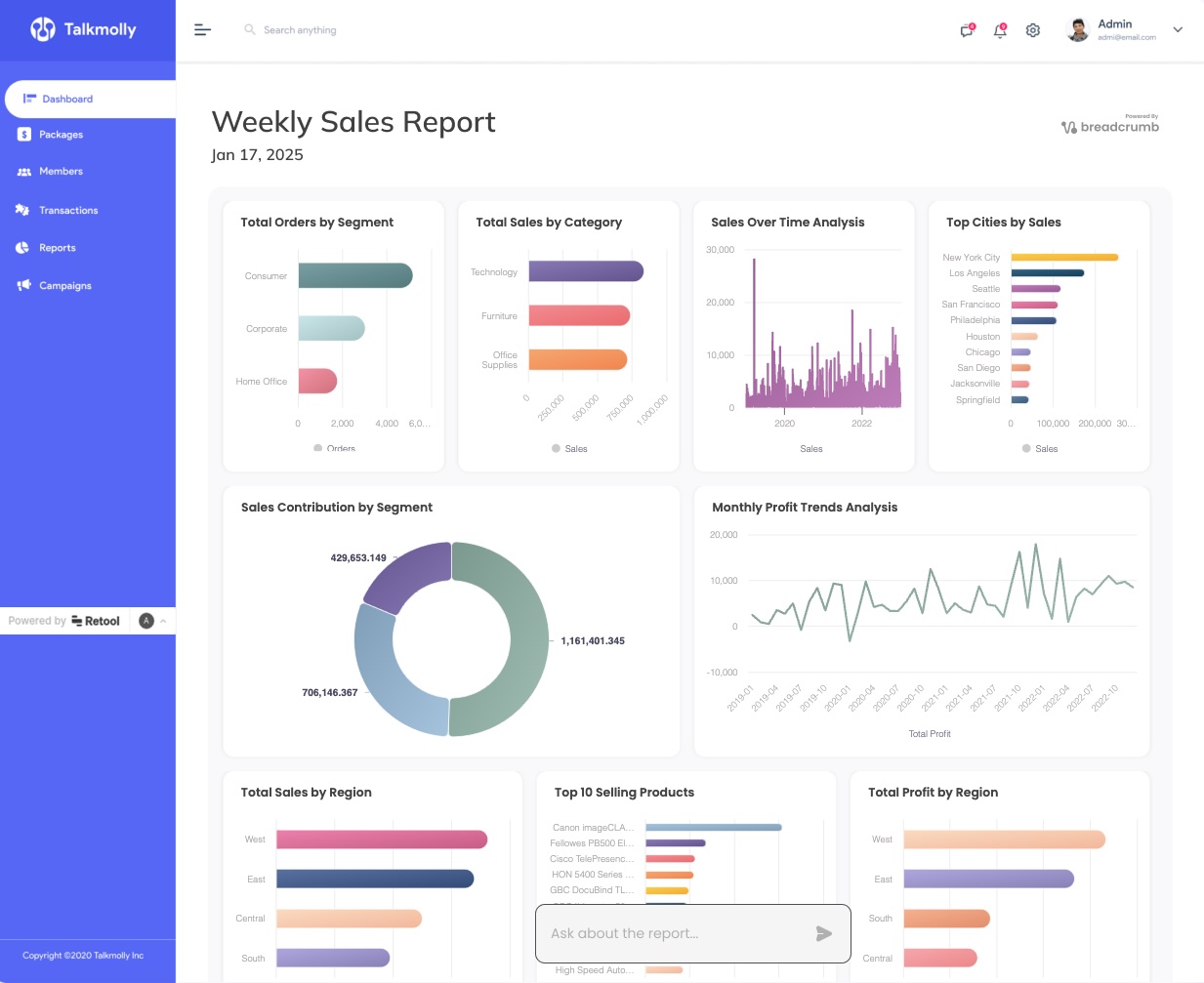
Learn how to create powerful analytics dashboards in Retool without writing any code or SQL. Build and embed dynamic data visualizations in minutes using generative AI.

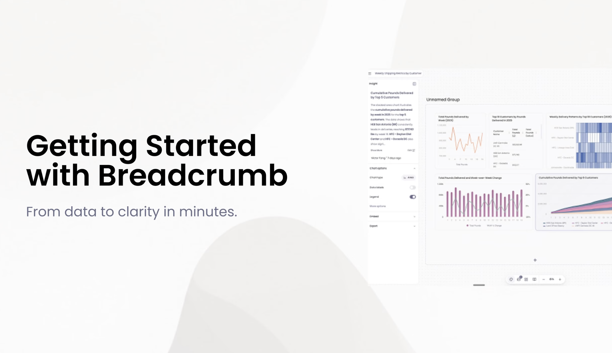
Learn how to set up and use Breadcrumb's AI-powered data analytics dashboard with our quick guide and 'Getting Started' video.

Streamline your workflow with Breadcrumb’s new sharing and collaboration features. Connect to multiple data sources, including Airtable, for dynamic, instantly shareable visualizations.

Transform your Airtable data into actionable insights with Breadcrumb's powerful visualization and analytics tools. Learn how to create beautiful, interactive dashboards that help you make better business decisions.

Join forces with the dynamic duo of web development – Tailwind CSS and astro.js. They're like Batman and Robin, but for your coding adventures. No capes required

Learn how to overcome Google Forms' limited analytics capabilities and transform your form data into powerful interactive dashboards using AI-powered tools like Breadcrumb.

A year ago it took hours to turn Excel and Google spreadsheets into interactive, shareable dashboards...